Your printed tablecloths has approximately three seconds to make a first impression that either elevates your brand or undermines it. In the competitive landscape of UK trade shows, from the bustling halls of ExCeL London to the prestigious venues of Manchester Central professional design isn't just about looking good; it's about communicating credibility, expertise, and attention to detail that translates directly into business opportunities.
Yet walk through any major UK exhibition and you'll witness a startling contrast: while some companies invest millions in their products and services, they present them on poorly designed branded tablecloths that actively damage their professional image. Meanwhile, savvy competitors with well-designed exhibition tablecloths capture attention, build trust, and generate more qualified leads from the same visitor pool.
The difference isn't budget. It's understanding the strategic principles behind professional tablecloth design and applying them effectively within the unique context of UK business culture and exhibition standards.
This comprehensive guide provides UK businesses with the specific design strategies, practical techniques, and cultural considerations needed to create branded tablecloths that don't just look professional, they actively enhance your brand positioning and business development objectives.
Understanding the UK Exhibition Environment
Venue-Specific Design Considerations
Major UK Exhibition Venues:
Each premier venue presents unique design challenges that professional tablecloths must address:
- ExCeL London: Massive halls with varied lighting conditions require designs that remain visible and professional under both bright exhibition lighting and dimmer networking areas
- NEC Birmingham: High ceilings and expansive spaces demand bold designs that maintain impact across longer viewing distances
- Olympia London: Historic venue aesthetics benefit from designs that balance modern branding with respect for traditional British business sensibilities
- Manchester Central: Industrial architecture requires designs that stand out against utilitarian backgrounds while maintaining professional sophistication
British Business Culture and Design Expectations
UK business culture particularly values understated professionalism, quality craftsmanship, and attention to detail. Your printed exhibition tablecloth design must reflect these cultural expectations while differentiating your brand from competitors.
Cultural Design Principles:
- Subtle sophistication over flashy promotion
- Quality materials that reflect business stability
- Clear, readable typography respecting British preferences for straightforward communication
- Professional colour palettes that work across formal and informal business contexts
Strategic Design Foundation: Brand Alignment and Objectives
Brand Consistency Assessment
Before designing your exhibition tablecloths, conduct a thorough brand audit to ensure design consistency across all marketing materials:
Visual Brand Elements:
- Logo variations and minimum size requirements for exhibition viewing distances
- Corporate colour codes including PANTONE specifications for accurate printing
- Typography guidelines ensuring readability across different fabric materials
- Brand messaging hierarchy determining which information takes priority
Brand Positioning Alignment:
- Premium positioning: Requires superior materials and refined design aesthetics
- Innovation focus: Benefits from modern design elements and bold colour choices
- Trust and stability: Emphasizes classic design principles and established brand elements
- Approachability: Uses warm colours and friendly typography while maintaining professionalism
Exhibition-Specific Objectives
Define specific objectives for your branded tablecloths beyond general brand awareness:
Lead Generation Focus:
- Contact information prominence for immediate engagement
- QR codes or web addresses driving digital interaction
- Clear value proposition encouraging booth visits and conversations
Relationship Building Priority:
- Professional presentation that facilitates meaningful business discussions
- Brand authority indicators that support expertise positioning
- Conversation starter elements that provide natural discussion topics
Product Showcase Support:
- Complementary design that enhances rather than competes with product displays
- Flexible presentation areas accommodating various product demonstration needs
- Background consistency providing professional context for product photography
Colour Psychology and Strategic Colour Selection
The Psychology Behind Professional Colour Choices
Colour psychology significantly impacts how UK exhibition visitors perceive your brand and business credibility. Industry experts note that clear, consistent table covers "go a long way to establish trust with your consumers," particularly when colour choices align with your overall brand strategy and target audience expectations.
Primary Colour Strategies:
Corporate Blue Applications:
- Trust building: Particularly effective for financial services, technology, and professional services
- Stability communication: Reinforces messages about reliability and established expertise
- International appeal: Works well for companies targeting global markets from UK exhibitions
- Professional networking: Ideal for B2B relationship building and partnership development
Sophisticated Black and Charcoal:
- Premium positioning: Communicates luxury and high-value services
- Professional authority: Particularly effective for legal, consulting, and executive services
- Versatile background: Allows product displays and marketing materials to stand out
- Photography friendly: Provides clean backgrounds for media coverage and social sharing
Energetic Red Applications:
- Attention grabbing: Effective for crowded exhibition environments requiring visibility
- Action orientation: Supports calls-to-action and immediate engagement objectives
- British brand heritage: Leverages positive associations with traditional British branding
- Technology and innovation: Communicates dynamism and forward-thinking approaches
Growth-Oriented Green:
- Sustainability messaging: Essential for environmental and green technology companies
- Growth and innovation: Supports messaging about business development and new opportunities
- Calming professionalism: Provides reassuring presence for healthcare and wellness sectors
- Natural product alignment: Perfect for organic, natural, and outdoor industry applications
Multi-Colour Design Strategies
Gradient and Tone Applications:
Modern printing techniques allow sophisticated colour transitions that create visual interest while maintaining professional appeal:
- Brand colour gradients that add depth without overwhelming the design
- Neutral base tones with accent colours highlighting key information
- Monochromatic variations providing visual texture while maintaining colour consistency
Strategic Accent Colours:
- Call-to-action emphasis drawing attention to contact information or promotional offers
- Information hierarchy guiding viewer attention through design elements logically
- Brand differentiation using unique colour combinations that distinguish your brand from competitors
Typography Excellence: Readability and Professional Impact
Font Selection for Exhibition Environments
Exhibition tablecloths present unique typography challenges that standard marketing materials don't face:
Viewing Distance Considerations:
- Close proximity reading (1 - 2 metres): Detailed information and contact details
- Medium distance visibility (3 - 5 metres): Company name and primary messaging
- Long distance recognition (6+ metres): Logo and brand colours only
Recommended Font Categories:
Sans-Serif Professional Fonts:
- Helvetica and Arial families: Clean, modern appearance with excellent readability
- Gotham and similar: Contemporary professional appearance popular in UK business design
- Open Sans and Source Sans: Web-friendly fonts that maintain consistency across digital and print materials
Serif Fonts for Traditional Industries:
- Times New Roman variants: Established professionalism for legal, financial, and consulting services
- Georgia and similar: Readable serif options that maintain dignity and tradition
- Custom serif fonts: Unique typography that reinforces premium brand positioning
Typography Hierarchy and Information Architecture
Primary Text Elements (Largest, Most Prominent):
- Company name: Maximum visibility for brand recognition
- Primary tagline: Key value proposition or brand message
- Logo integration: Seamless combination of text and visual elements
Secondary Text Elements (Medium Size, Supporting Information):
- Service descriptions: Brief, benefit-focused descriptions of key offerings
- Contact information: Phone, email, and website details for lead generation
- Exhibition-specific information: Stand numbers, demonstration times, special offers
Tertiary Text Elements (Smaller, Detailed Information):
- Regulatory information: Required certifications, accreditations, or compliance details
- Social media handles: Digital engagement opportunities and follow-up connections
- QR codes and technical details: Advanced engagement options for interested prospects
Readability Optimization Techniques
Contrast and Legibility:
- High contrast ratios ensuring text remains readable under various exhibition lighting conditions
- Background colour selection that supports rather than competes with text legibility
- Font weight variation creating hierarchy without relying solely on size differences
Text Spacing and Layout:
- Generous white space preventing cluttered appearance that reduces professional impact
- Logical information grouping guiding viewer attention through design elements systematically
- Consistent alignment creating professional appearance and easy information processing
Logo Integration and Brand Element Placement
Strategic Logo Positioning
Your logo placement significantly impacts brand recognition and professional impression:
Primary Logo Placement (Front Panel):
- Upper centre or upper left: Traditional placement that aligns with Western reading patterns
- Size considerations: Large enough for recognition from 5 - 7 metres away
- Background integration: Sufficient contrast and space for clear visibility
Secondary Logo Applications:
- Side panels: Smaller logos maintaining brand presence from multiple viewing angles
- Corner positioning: Subtle brand reinforcement without overwhelming other design elements
- Watermark applications: Very subtle background branding that doesn't interfere with readability
Brand Element Consistency
Visual Consistency Checklist:
- Logo proportion accuracy maintaining official brand guidelines across all applications
- Colour specification compliance ensuring PANTONE or RGB colour accuracy
- Spacing and clear space respecting minimum distance requirements around logos
- Co-branding considerations when featuring partner or certification logos alongside primary branding
Professional Finishing Details
Quality Indicators:
- Sharp, crisp logo reproduction demonstrating attention to detail and quality standards
- Consistent colour saturation across all logo applications and brand elements
- Professional edge treatment preventing fraying and maintaining appearance over time
- Accurate sizing ensuring logos appear proportional and professionally integrated
Layout Principles for Maximum Professional Impact
Grid-Based Design Systems
Professional exhibition tablecloth design benefits from systematic grid layouts that create visual harmony and information hierarchy:
Three-Panel Layout System:
- Front panel focus: Primary branding, company name, and key messaging
- Side panel support: Secondary information, contact details, and additional branding
- Back panel consideration: Often overlooked but valuable for neighbouring stands and walkway visibility
Information Zones:
- Visual hierarchy creation guiding viewer attention logically through design elements
- White space utilization preventing cluttered appearance that reduces professional impact
- Balanced composition creating pleasing proportions that enhance brand perception
Functional Design Considerations
Table Integration:
- Product display accommodation ensuring tablecloth design doesn't compete with demonstrations
- Literature placement planning designating areas for brochures, business cards, and promotional materials
- Interactive element support providing space for tablets, demonstration equipment, or sampling stations
Setup and Maintenance:
- Wrinkle-resistant design maintaining professional appearance throughout multi-day exhibitions
- Soil-hiding considerations choosing colours and patterns that maintain appearance despite heavy use
- Easy setup indicators subtle design elements that assist with proper installation and alignment
Material Selection and Quality Considerations
Fabric Choice Impact on Design
The material you choose significantly affects how your design appears and performs in exhibition environments:
Polyester Blend Advantages:
- Colour retention maintaining brand colours accurately over multiple uses and cleanings
- Wrinkle resistance ensuring professional appearance without constant maintenance
- Durability withstanding repeated setup, breakdown, and transport cycles
- Print quality accepting high-resolution graphics and detailed design elements effectively
Premium Material Options:
- Stretch fabrics providing sleek, fitted appearance that enhances professional presentation
- Flame-retardant treatments ensuring compliance with UK venue safety regulations
- Easy-care properties simplifying maintenance and extending useful life
- Environmental considerations supporting sustainability messaging through eco-friendly material choices
Print Quality and Production Considerations
Digital Printing Specifications:
- Resolution requirements ensuring sharp graphics and text at all viewing distances
- Colour matching accuracy maintaining brand colour consistency across different production runs
- Edge finishing options providing professional appearance and preventing fraying
- Quality control processes ensuring consistent results that meet professional standards
Production Timeline Planning:
- Design approval processes allowing sufficient time for revisions and refinements
- Printing and finishing time typically 7 - 14 days for custom exhibition tablecloths
- Shipping considerations ensuring delivery well in advance of exhibition dates
- Backup planning considering replacement options for unexpected damage or loss
UK-Specific Design Considerations For Printed Tablecloths
Regulatory and Compliance Requirements
Fire Safety Standards:
UK exhibition venues require flame-retardant materials meeting British Standards:
- BS 5867 Part 2 Type B certification for most exhibition venues
- Crib 5 compliance for higher-risk venues and applications
- Documentation requirements maintaining certificates for venue compliance verification
Health and Safety Considerations
Slip-resistant materials preventing safety hazards in high-traffic exhibition environments
Secure attachment systems ensuring tablecloths remain properly positioned throughout events
Emergency access designing layouts that don't obstruct required safety access or signage
Cultural Design Sensitivities
British Business Aesthetics:
- Understated elegance rather than aggressive promotional messaging
- Quality over quantity emphasizing superior materials and craftsmanship
- Traditional colour appreciation respecting established British colour associations and preferences
- Professional restraint avoiding overly casual or informal design approaches in business contexts
Regional Considerations:
- London sophistication requiring polished, metropolitan design sensibilities
- Northern England practicality appreciating straightforward, functional design approaches
- Scottish business culture valuing tradition, quality, and established professional standards
- Welsh market preferences balancing modern innovation with respect for heritage and community
Design Process and Implementation
Professional Design Development
Initial Concept Phase:
- Brand audit and objective setting establishing clear design parameters and success criteria
- Competitive analysis understanding market positioning and differentiation opportunities
- Concept sketching exploring multiple design approaches before digital development
- Stakeholder input gathering feedback from sales teams, marketing staff, and key customers
Design Refinement Process
- Digital mockup creation using professional design software for accurate representation
- Multiple variation development exploring different layout, colour, and typography options
- Technical specification review ensuring design compatibility with production requirements
- Print testing conducting small-scale tests to verify colour accuracy and material compatibility
Quality Assurance and Testing
Pre-Production Verification:
- Proof approval processes ensuring design accuracy and stakeholder satisfaction
- Colour matching verification confirming brand colour accuracy across different lighting conditions
- Size and measurement confirmation preventing costly errors in final production
- Material sample approval verifying fabric choice meets quality and appearance expectations
Post-Production Quality Control:
- Inspection procedures checking print quality, colour accuracy, and finishing details
- Setup testing confirming easy installation and professional appearance when properly displayed
- Durability assessment evaluating material performance and design longevity expectations
- Packaging and shipping protection ensuring products arrive in perfect condition for first use
Measuring Design Success and ROI
Performance Metrics for Exhibition Tablecloth Design
Direct Engagement Measures:
- Booth visitor counts comparing periods with professional tablecloth design versus generic alternatives
- Lead generation improvements tracking qualified prospects and contact information collection
- Conversation starter effectiveness measuring how often tablecloth design facilitates meaningful discussions
- Brand recognition surveys assessing visitor recall and brand association improvements
Indirect Brand Impact:
- Photography and media coverage evaluating how often professional tablecloth appears in exhibition coverage
- Social media mentions tracking user-generated content featuring your exhibition setup
- Competitor comparison assessing relative professional appearance and visitor engagement
- Long-term relationship building measuring how professional presentation impacts business development
Cost-Effectiveness Analysis
Investment Justification:
- Cost per impression calculating brand exposure value across multiple exhibition uses
- Lead generation cost comparing tablecloth investment to other marketing channel expenses
- Professional credibility value assessing impact on high-value prospect perceptions and business development
- Multi-event amortization spreading design and production costs across multiple exhibition applications
Common Design Mistakes to Avoid
Typography and Readability Errors
Font Size Inadequacy:
Many UK businesses underestimate the font sizes needed for exhibition environments, resulting in tablecloths that look professional up close but become illegible at typical viewing distances.
Brand Consistency Failures
Logo Proportion Errors:
Using logos that are too small to be effective or too large to appear professional, particularly when multiple logo variations are included on the same tablecloth.
Colour Specification Problems:
Failing to use accurate PANTONE or colour specifications, resulting in brand colours that don't match other marketing materials and weaken brand recognition.
Typography Mixing:
Using too many different fonts or font weights, creating unprofessional appearance that suggests lack of attention to detail.
Production and Quality Oversights
Material Quality Compromises:
Choosing low-quality fabrics to save money, resulting in tablecloths that look unprofessional, wrinkle easily, and reflect poorly on brand quality standards.
Print Resolution Inadequacy:
Using low-resolution graphics or logos that appear pixelated or blurred when printed at tablecloth size, immediately communicating poor attention to detail.
Poor Planning Timeline:
Rushing design and production processes, leading to errors, compromises, and missed exhibition deadlines that force use of inferior alternatives.
Conclusion: Professional Design as Strategic Investment
Designing a professional exhibition tablecloth requires more than aesthetic sensibility, it demands strategic thinking that aligns visual design with business objectives, cultural expectations, and practical exhibition requirements. In the competitive UK exhibition environment, professional tablecloth design serves as both immediate marketing tool and long-term brand asset.
The most successful UK businesses recognize that exhibition tablecloth design isn't an expense, it's an investment in professional credibility, brand recognition, and business development that pays dividends across multiple events and countless prospect interactions.
Every design decision, from colour psychology to typography hierarchy, from material selection to logo placement, contributes to an overall impression that either enhances or undermines your business objectives. Professional design demonstrates attention to detail, quality standards, and brand investment that prospects associate with business competence and reliability.
Your exhibition tablecloth works continuously throughout every event, communicating brand values and professional standards to every visitor who approaches your stand. Make sure that communication reinforces rather than contradicts your business positioning and marketing objectives.
Invest in professional design that reflects your brand quality and business ambitions. Your prospects, partners, and competitors will notice the difference, and your business results will reflect the strategic value of truly professional exhibition presentation.
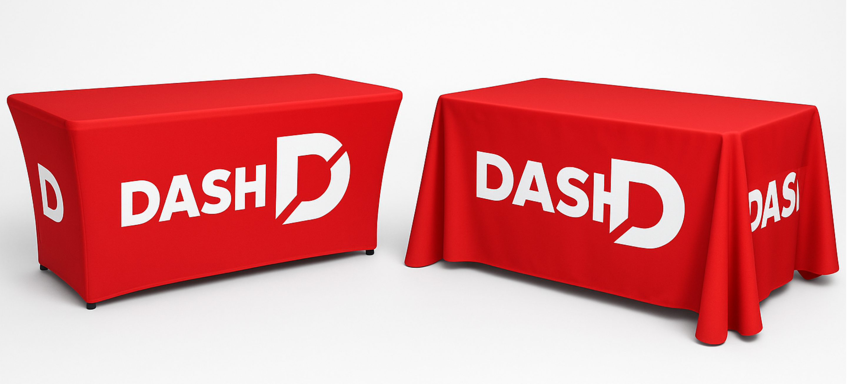 Stretch branded tablecloth (left) and a standed printed tablecloth (right) | by Northern Flags in Leeds